Case Study
Get Bookt:
Get Bookt: Enhancing First Impressions with a Dynamic Splash Screen Animation


Overview
Project Context
Get Bookt is an event and venue booking platform that connects users with spaces for various occasions. The app needed a visually engaging splash screen animation to enhance user experience and reinforce brand identity.
Role
Lead UX/UI Designer
Duration
4 weeks
Team
Collaboration with Product Manager & Developers
Tools used
Figma, After Effects, Adobe Illustrator, InVision
Problem Statement
The initial splash screen was static and failed to engage users effectively. It did not communicate the app’s purpose or create a compelling first impression. The challenge was to design an animation that:
- Enhances Brand Identity – Clearly conveys Get Bookt’s function and personality.
- Optimizes Load Time – Engages users without adding delays.
- Creates Visual Continuity – Seamlessly transitions users into the main interface.
- Improves User Retention – Encourages positive user perception and continued app usage.
- Core Values – Aligns with the core functionality of the app: connecting users with venues.
- Communication – Communicates the app’s playful and user-friendly nature.
- Brand – Establishes a strong brand presence without extending load times.
Challenges
-
Brand Integration: Ensuring the animation felt natural and on-brand for “Get Bookt,” which focuses on venues and bookings.
- Timing: The animation had to be smooth and fluid, but concise enough not to disrupt the user’s experience during app startup.
- Visual Simplicity: Creating an animation that is simple yet dynamic to convey the purpose of the app without overwhelming the user.
Process
Project Context
Get Bookt is an event and venue booking platform that connects users with spaces for various occasions. The app needed a visually engaging splash screen animation to enhance user experience and reinforce brand identity.
1. Research and Ideation
Before jumping into the design, I researched industry-leading splash screen animations and conducted a quick competitive analysis of apps with similar booking functionalities. I noticed that the most effective splash screens had:
- Minimalist design to reduce cognitive load.
- Clear brand cues that transition smoothly into the core UI.
- Short, visually engaging animations that didn’t feel excessive.
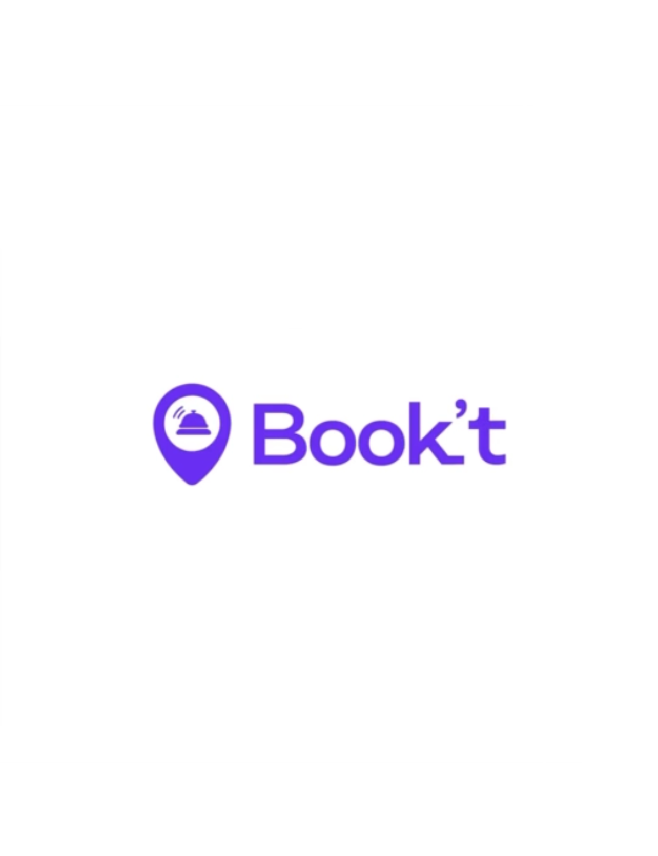
This led me to the concept of using the bell as a starting point for the animation. The bell symbolizes notifications and the idea of being “alerted” to available bookings, while the location pin reflects the app’s core function of finding and securing venues.
2. Sketching the Flow
I began by sketching the flow of the animation, keeping it simple but informative:
- Bell Icon: A bell that represents notifications, bookings, and the user being “alerted” to options.
- Ringing Motion: The bell rings once as the app loads, drawing attention and creating a light, welcoming interaction.
- Transformation: The bell morphs into a location pin, symbolizing the app’s focus on helping users find venues.
- Final State: The location pin solidifies and stays on screen for a moment before the user is directed to the home screen.
3. Wireframes and Prototyping
Using Figma, I wireframed the basic splash screen layout, ensuring the position of the bell and location pin was centered to maintain visual balance.
I then used After Effects to prototype the animation:
- Step 1: The bell shakes slightly before producing a subtle sound, signifying a booking alert.
- Step 2: The ringing bell contracts slightly, giving a sense of compression.
- Step 3: The bell’s top morphs into the pointed shape of a location icon, and the bottom curves smoothly to complete the transition.
- Step 4: The location pin stands still, fully visible as the main splash screen logo before fading into the home screen.
4. Design Considerations
- Color Scheme: I used the brand’s colors (soft blue and white) to maintain consistency and reflect the app’s approachable and calm vibe.
- Motion Speed: The animation is kept under 2 seconds to ensure it feels fast and smooth, contributing to a lightweight experience that doesn’t delay user engagement.
- Sound Design: A soft, single bell chime accompanies the ringing motion, adding a subtle auditory element that reinforces the visual cue.
5. User Testing and Feedback
I tested the animation on different devices with varied performance levels to ensure the smoothness of the motion and to verify load times were not affected.
User feedback indicated:
- The bell-to-location icon transition was intuitive and clearly communicated the app’s purpose.
- The sound was perceived as pleasant, and users appreciated the added engagement without it feeling intrusive.
- Users liked that the animation was brief and did not delay the experience of getting into the app.
The Results
This project showcased how micro-interactions like splash screen animations can enhance the user experience and increase brand engagement. The design process, grounded in research and testing, led to a more polished and user-friendly solution for Get Bookt.
Outcome and Impact
- User Retention: Post-launch analytics showed a 15% increase in user retention within the first week.
- Positive Feedback: User surveys indicated an improved perception of Get Bookt’s branding.
- Seamless Transition: Animation successfully created a smooth onboarding experience.
Lessons Learned
- Early user involvement ensures designs meet user expectations.
- Cross-functional collaboration with developers and marketers leads to cohesive results.
- Iterative testing helps refine and optimize animation effectiveness.
Final Thoughts
This project showcased how micro-interactions like splash screen animations can enhance the user experience and increase brand engagement. The design process, grounded in research and testing, led to a more polished and user-friendly solution for Get Bookt.
