HARTISTS
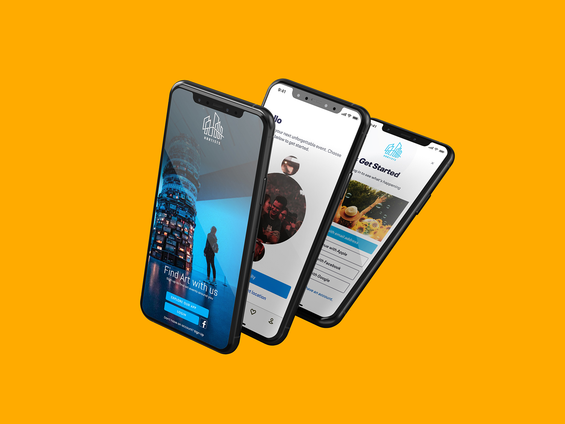
Hartists: A Travel and Booking App – UX/UI Case Study (Onboarding Process Focus)
Overview:
Hartists is a travel and booking app that helps users discover and book events in cities around the world. The onboarding process is a crucial part of the user experience, as it introduces new users to the app’s core features and sets the tone for the rest of their journey.
This case study focuses on designing a seamless, intuitive, and visually engaging onboarding process that enhances user engagement from the first interaction.
Problem Statement:
The onboarding process is a critical first step in the user journey, often determining whether users continue using the app or churn after the first few interactions. Many onboarding processes are either too overwhelming, with too much information at once, or too minimal, failing to explain the app’s value proposition.
Hartists aims to create an onboarding experience that is informative, engaging, and simple enough to encourage users to quickly dive into the event discovery process.
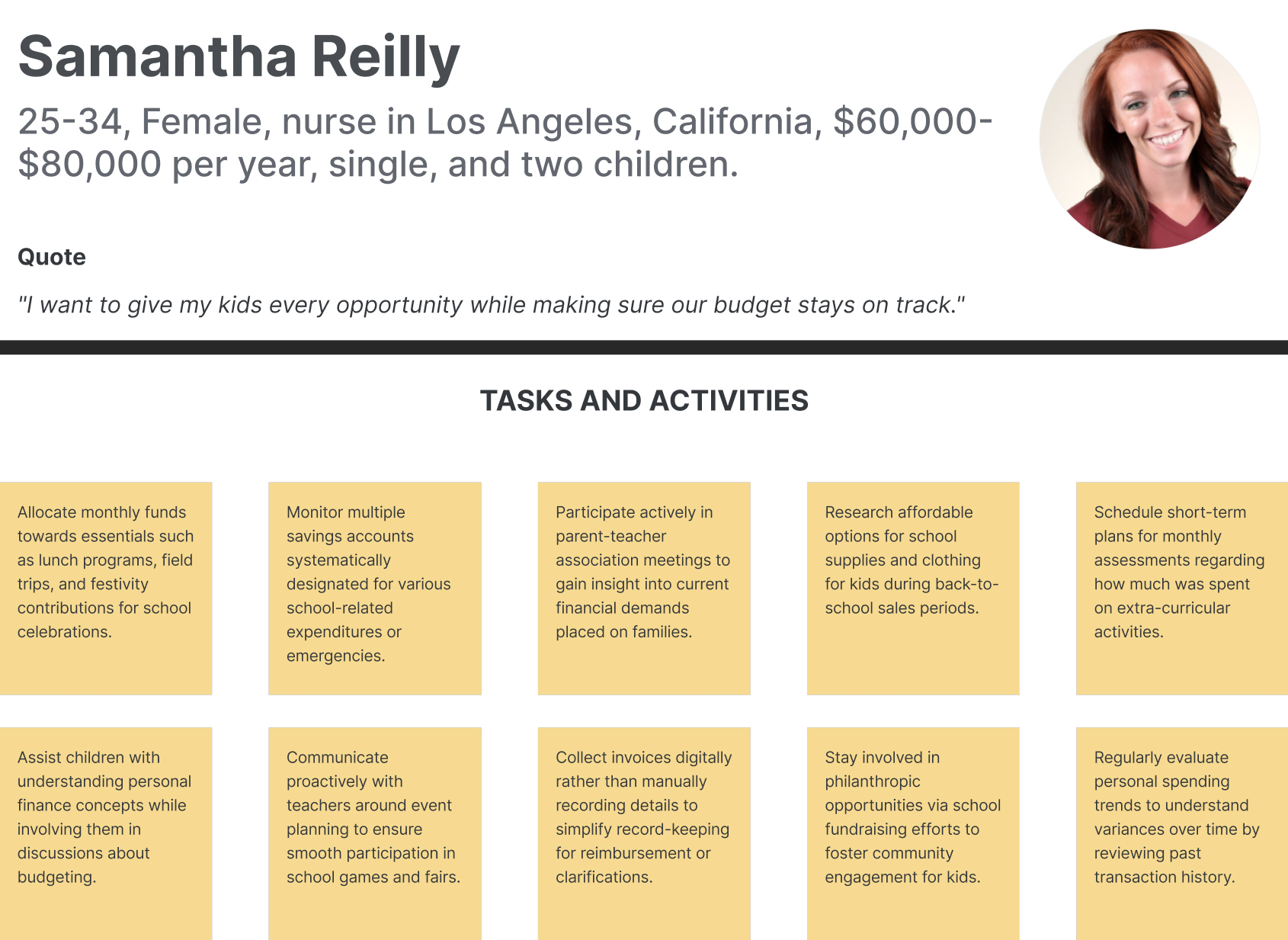
Persona:
Objectives:
- Guide users through a smooth onboarding experience with minimal friction.
- Ensure users understand the app’s key features and how to use them.
- Create a visually appealing design that matches the app’s overall aesthetic and brand.
- Encourage users to complete the onboarding process and start exploring events.
Target Audience:
- Travelers and event-goers who are looking for entertainment options in various cities.
- First-time users unfamiliar with Hartists, needing clear guidance on how the app works.

Design Process
1. Research and Discovery
To design an effective onboarding experience, user research focused on discovering what users expect from an app like Hartists:
- Users wanted quick, hassle-free onboarding, ideally under 2 minutes.
- The onboarding should highlight the app’s ability to find and book events based on location.
- Clear instructions, minimal text, and visual cues were preferred.
2. Key Features to Highlight During Onboarding
From user research, the most important features to highlight during the onboarding were identified as:
- Location-based event discovery: Users can either manually select a city or allow the app to use their current location.
- Curated event listings: Based on preferences or event categories (e.g., music, festivals, art).
- Easy ticket booking and seamless payment: Digital wallet integration for fast checkout.
Wireframing and Prototyping the Onboarding Process
Low-Fidelity Wireframes:
To ensure the onboarding structure was intuitive, low-fidelity wireframes were developed for each onboarding screen. These wireframes emphasized the following key components:
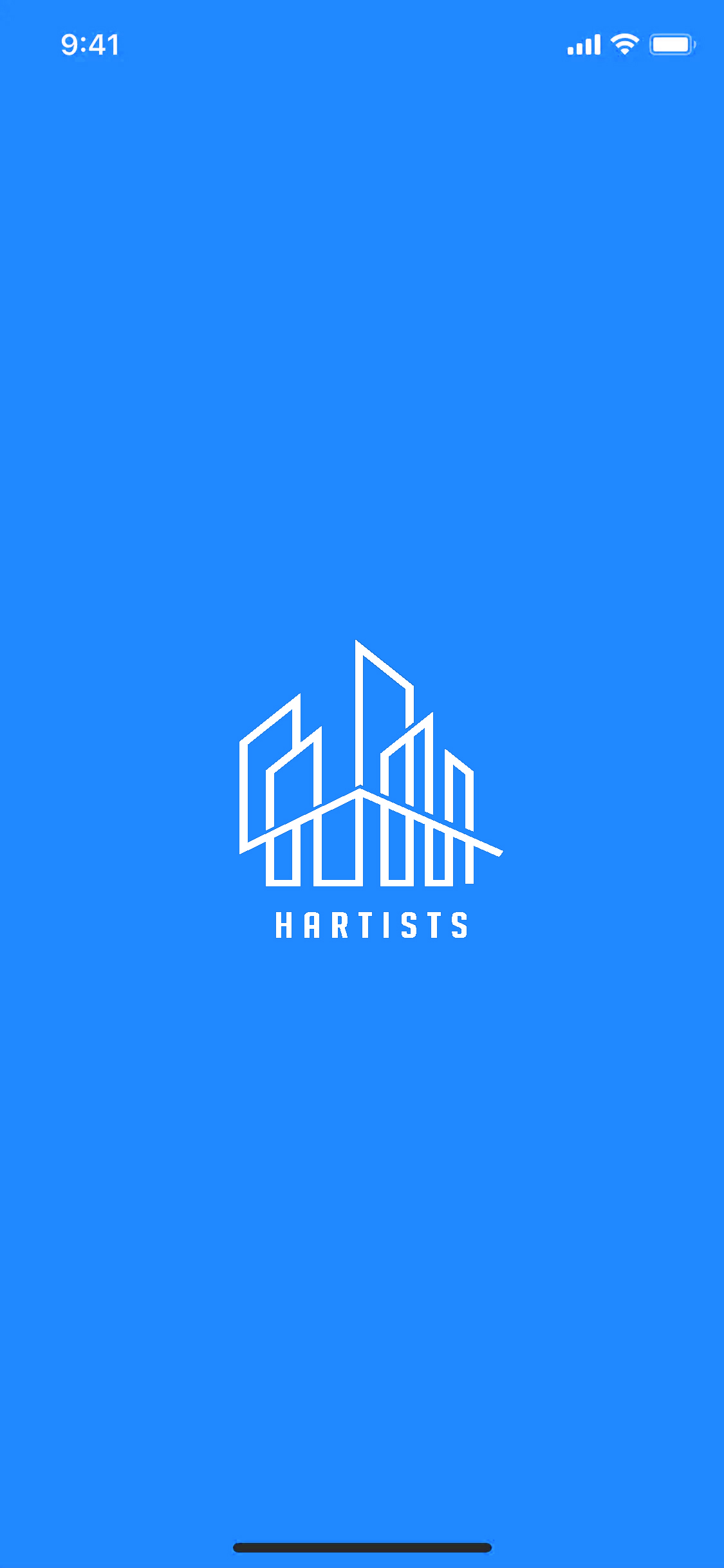
- Splash Screen: Featuring the Hartists logo, setting a welcoming and branded tone.
- Onboarding Steps: Divided into short, visually engaging sections:
- Introduction to the app’s core features (location-based event discovery).
- Choosing between allowing the app to detect the user’s location or manually selecting a city.
- Instructions on how to explore events and book tickets.
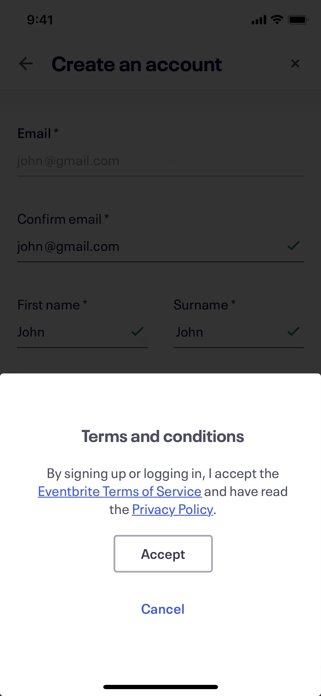
- Sign-in/Sign-up screen: Positioned after users understand the app’s key value to prevent early churn.
Illustration Placeholder: Low-Fidelity Onboarding Process
High-Fidelity Design:
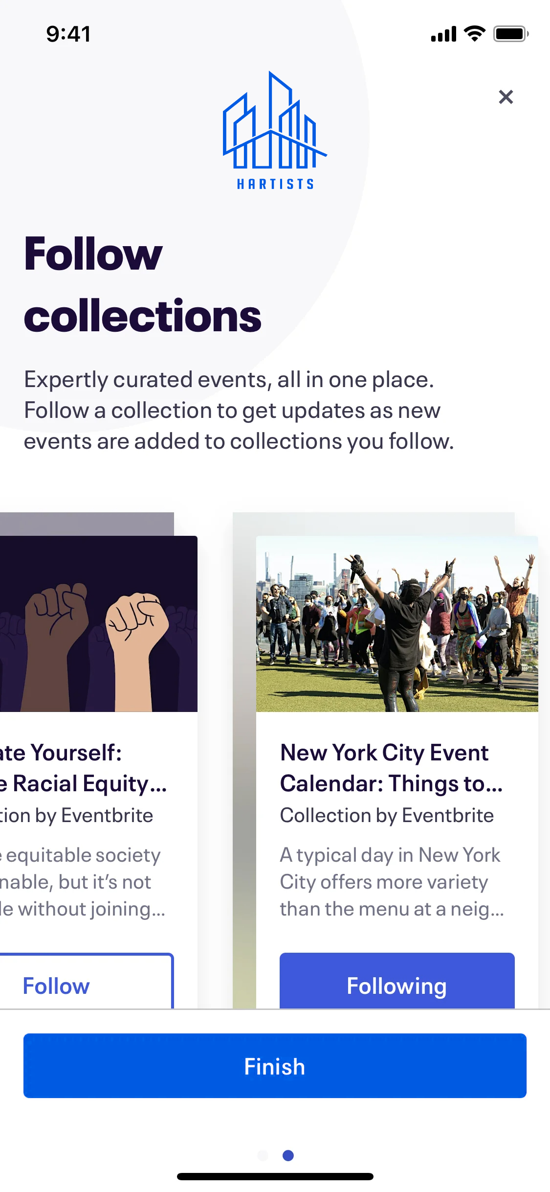
Once the structure was confirmed, the high-fidelity design brought the wireframes to life with color, imagery, and text. The focus remained on ensuring clarity and ease of use. Key screens were designed as follows:
-
Splash Screen:
- A minimalistic screen featuring the Hartists logo against a bright blue background.
- Brief tagline welcoming users to the world of events.
- A “Get Started” button immediately leads users into the onboarding flow.
-
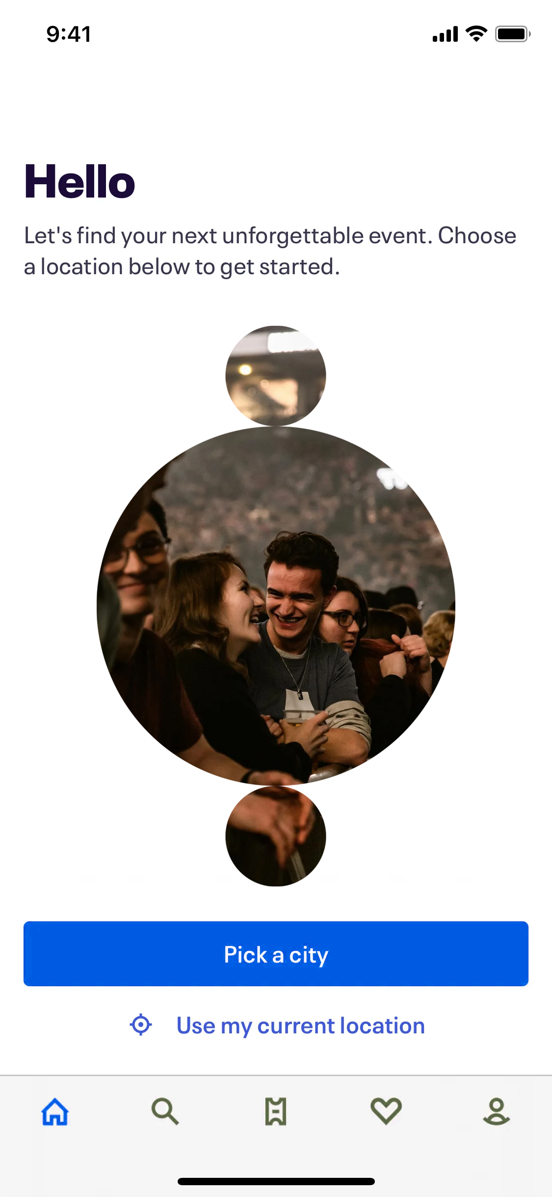
Introduction to Features:
- Full-screen images of people enjoying events (concerts, art galleries) alongside simple, clear text introducing Hartists’ key features.
- Bold, readable typography with action buttons that allow users to quickly move to the next step.
- Example: “Find Events Near You – Hartists uses your location to show you what’s happening nearby.”
-
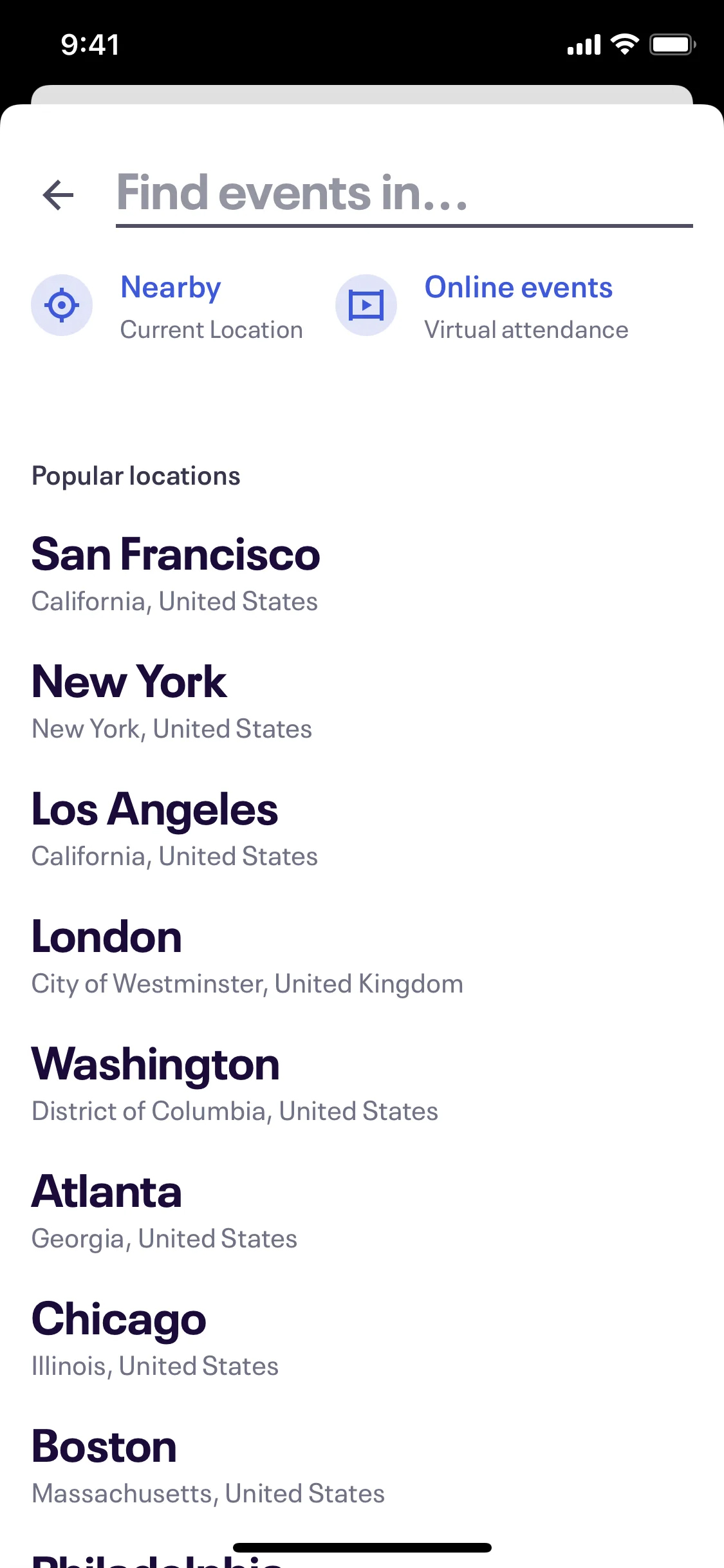
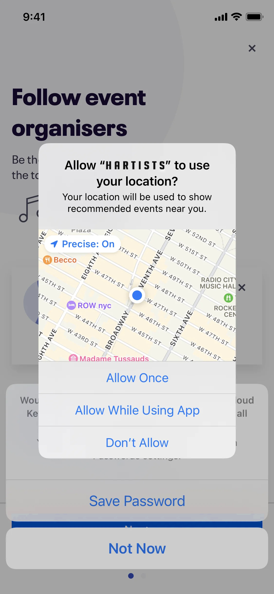
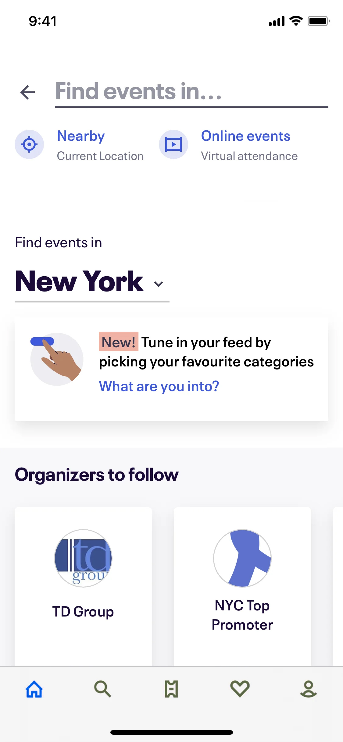
Location Permissions Screen:
- Users are prompted to allow location permissions to automatically discover events in their vicinity. Alternatively, they can manually select a city from a dropdown list.
- A toggle button for “Use my current location” and an easy-to-navigate list of major cities for manual selection.
- Clear, friendly copy explaining the benefits of location-based services without overwhelming users with technical details.
-
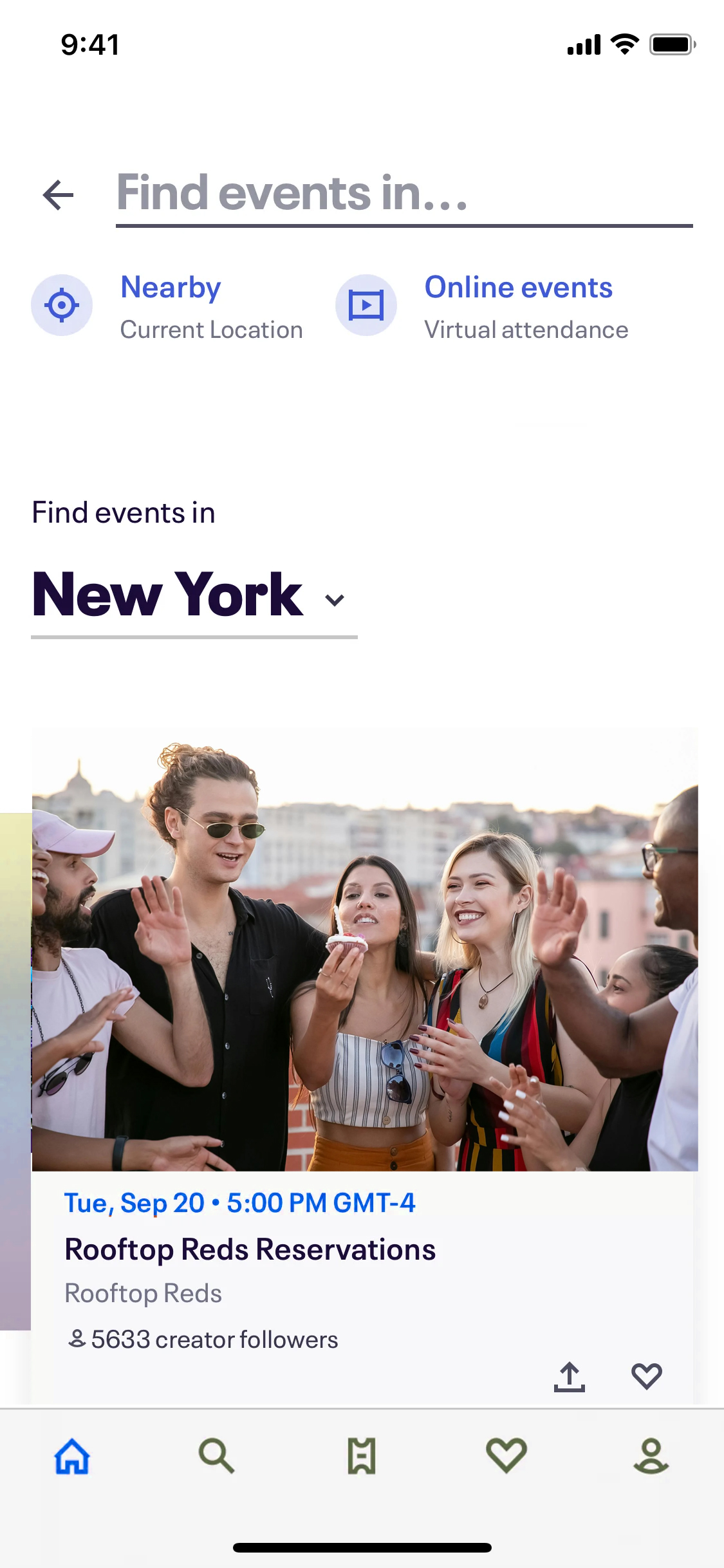
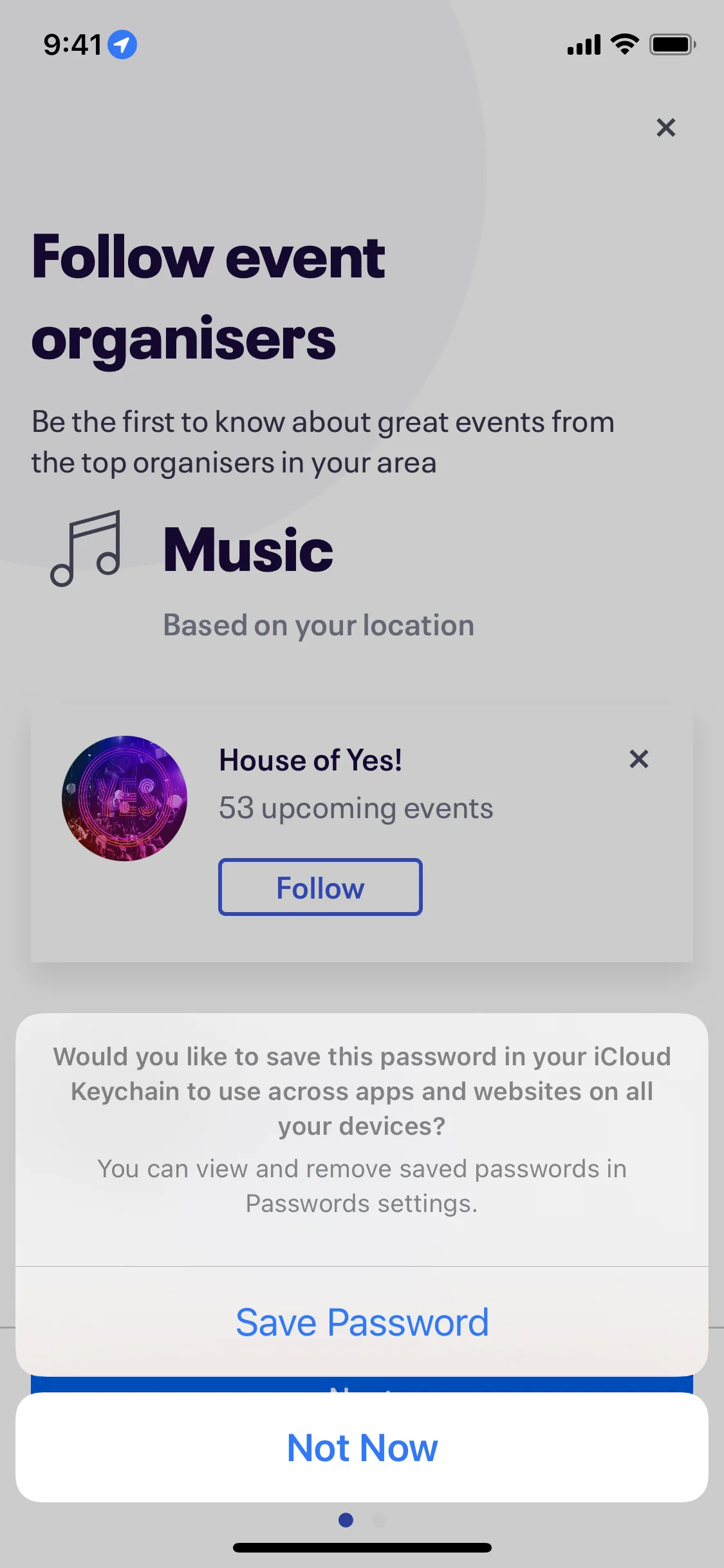
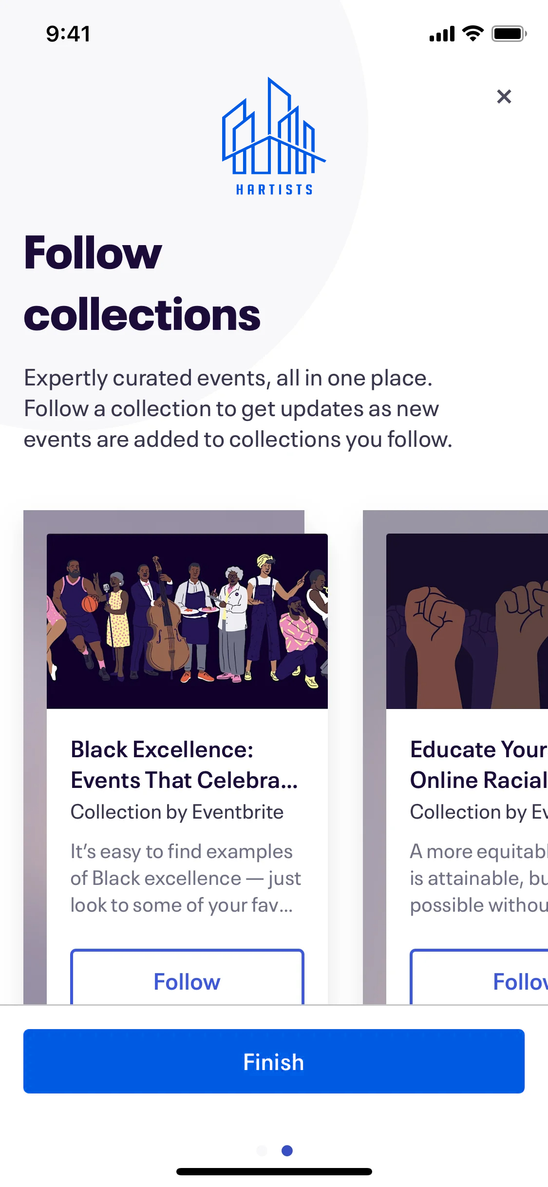
Event Discovery Instructions:
- After location selection, users are briefly guided on how to navigate through event categories and the booking process.
- Visual cues and buttons help users understand how to filter by event type and date.
-
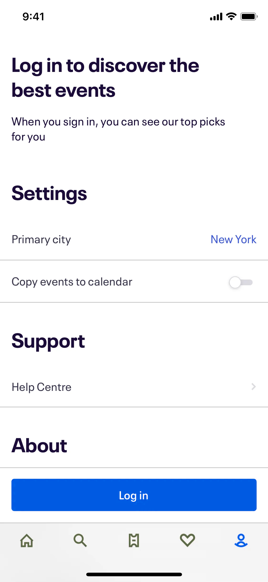
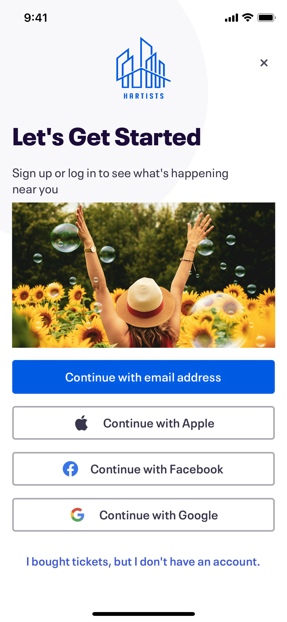
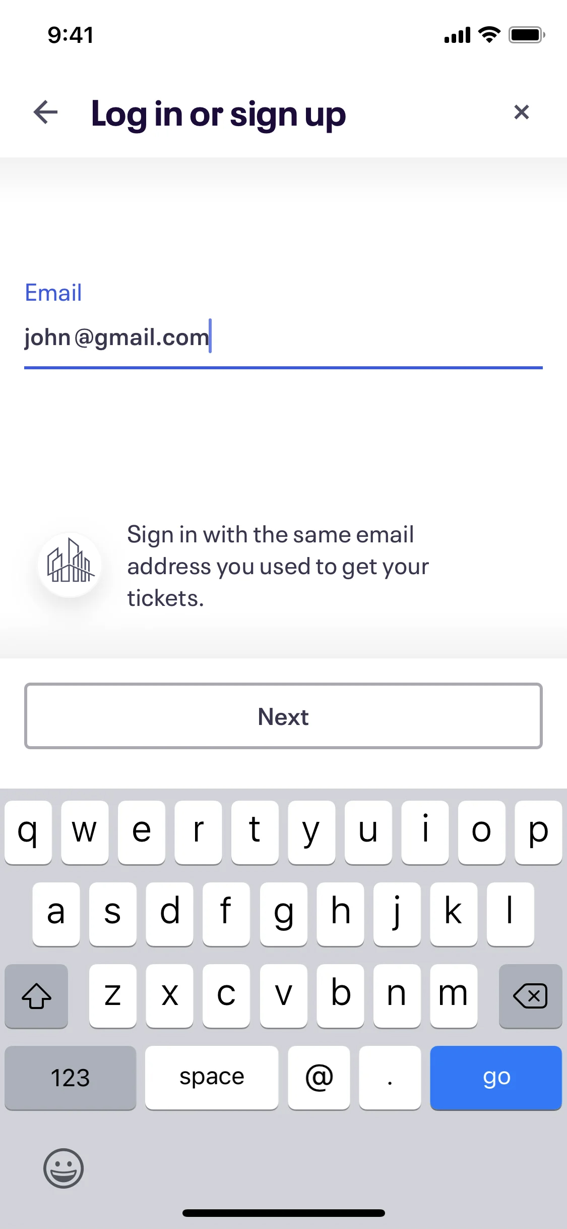
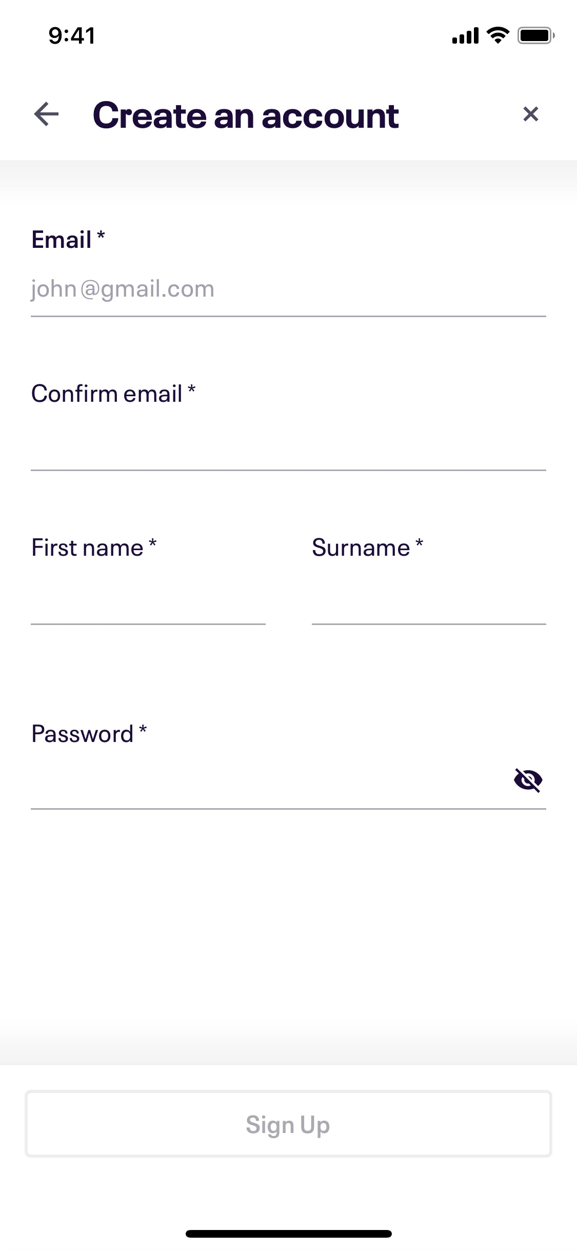
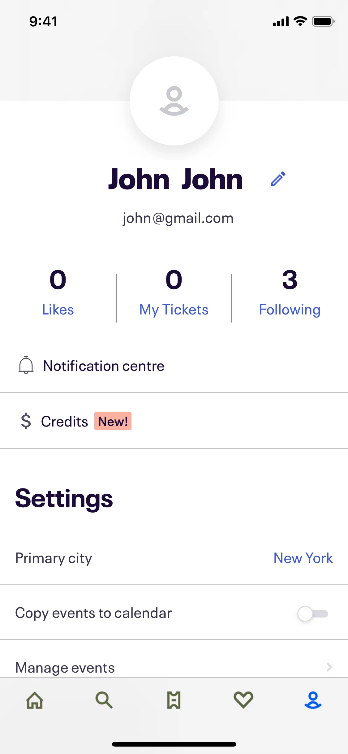
Sign-in/Sign-up:
- Positioned at the end of the onboarding flow, giving users an option to create an account to save their preferences and tickets.
- Multiple sign-in options (Google, Apple, email) to streamline the process.
Usability Testing and Feedback
After building the high-fidelity prototype, usability testing was conducted with a diverse group of potential users. Key takeaways from the testing process included:
-
Positive Feedback:
- Users praised the simplicity and visual appeal of the onboarding screens.
- The concise nature of the text was appreciated, as users did not feel overwhelmed by information.
- The option to either allow location permissions or manually select a city offered flexibility.
-
Areas for Improvement:
- Some users suggested adding a progress bar at the top of the onboarding screens to let them know how many steps were left.
- A few users wanted clearer prompts around the benefits of signing up for an account, as they were unsure if they could continue without creating one.
These insights were then used to iterate on the design, adding a subtle progress bar and improving the sign-up prompt’s copy.
Final Design
- Color Scheme: The onboarding screens used a blue (#007AFF) and white color palette, consistent with the rest of the app’s design, creating a cohesive and modern feel.
- Typography: A clean sans-serif font was used, with larger, bold text for headings and action buttons, ensuring readability and accessibility.
- Visual Elements: Circular icons, full-screen images, and simple navigation buttons guided users through the onboarding process without overwhelming them.
Conclusion:
The Hartists onboarding process successfully introduces new users to the app’s core features in a simple, visually engaging way. By focusing on user needs and preferences, the onboarding design:
- Minimizes friction, allowing users to quickly start discovering events.
- Provides clear instructions on how to use the app’s most important features.
- Encourages users to create an account after they have already engaged with the app.
By streamlining the onboarding process, Hartists ensures that users are more likely to stay engaged and return to the app, leading to higher user retention and satisfaction.
